Kyle Richardson on grammys.house
Submit a handmade website to Gossip's Web →Where did you make grammys.house?
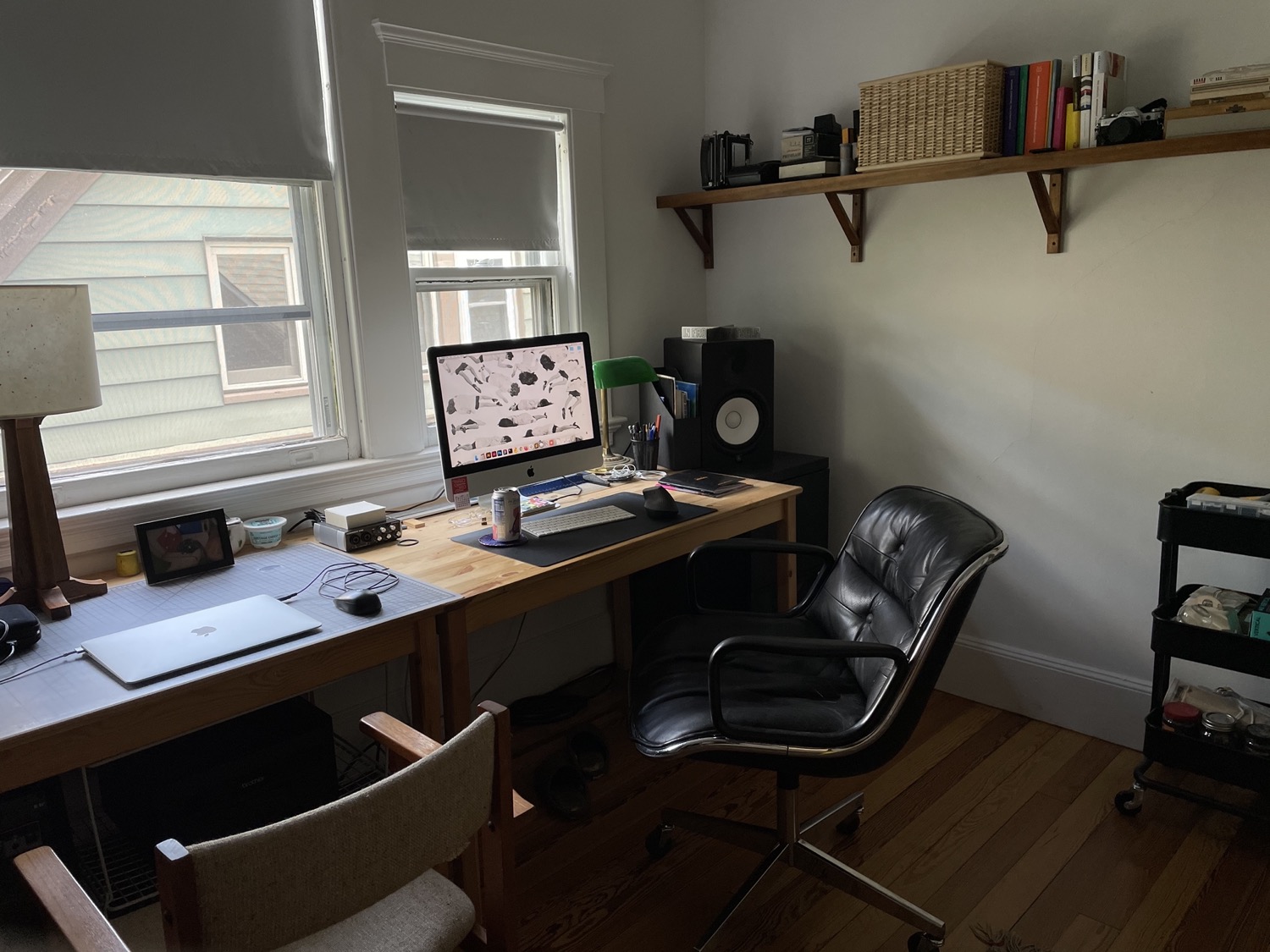
I started grammys.house during the fall 2020 session of Fruitful School, which met in virtual space via Whereby and Discord. Physically, I made it while sitting in this apartment and office/studio located in New Haven, CT that I share with my partner, Cody Boyce.
What tools/technology did you use to make grammys.house?
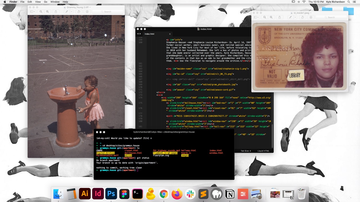
I used Sublime Text to write HTML/CSS/JS, Hyper Terminal (to push changes to Github), the domain is from Namecheap, and the site lives on Github Pages. I wrote some Jquery and used this flipbook.js library. I used a negative film scanner to scan slides and ~150-200 photos. the floorplan svg navigation for the site was made on Figma. the audio is from an ASMR youtube video of someone driving on the FDR drive, that Cody then cut down to a manageable size and exported as an mp3 through Ableton. I used Are.na for inspiration, to save snippets of code, to upload materials and work through my thoughts on this project.
How did you come up with the idea for grammys.house? It seems like there's a lot of behind-the-scenes work that went into it, especially all the beautiful archival photos on https://grammys.house/window.html.
My grandma, Stephania Hassan, moved from Queens, NY to Egypt a couple of years ago with her husband. As she was packing up her house she gave me a big box of photos and printed ephemera that she'd taken and collected over the course of her life in the city. grammys.house originally was going to be a digital dollhouse, centered around the dolls that my grandma has made (the documentation photos of these dolls made up a significant part of this box). She is an artist and has made and collected dolls her whole life: as a hobby, as commissioned pieces, and for work when she ran a doll making therapy group as a social worker at Gouverneur Hospital. Even now she still makes dolls! She always tried to pass the doll interest down to me, but it's not something that caught on haha.
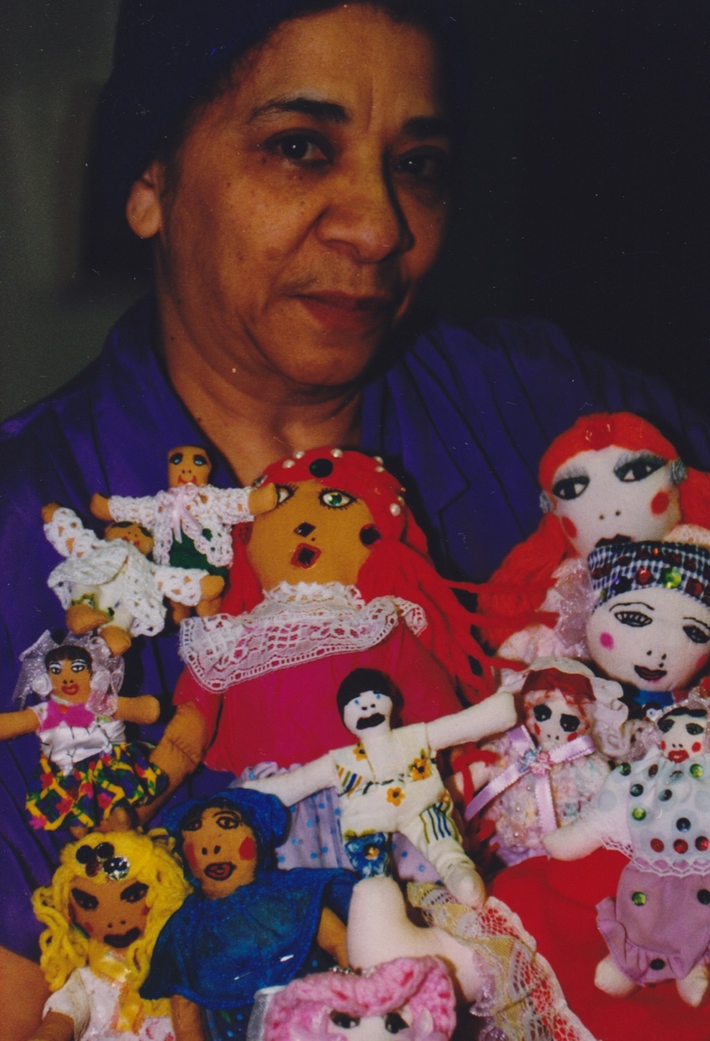
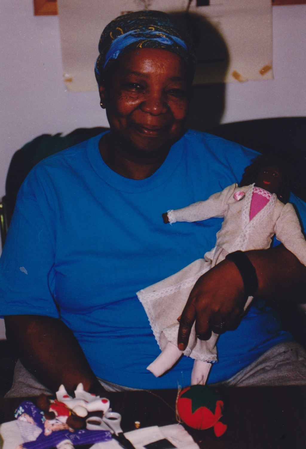
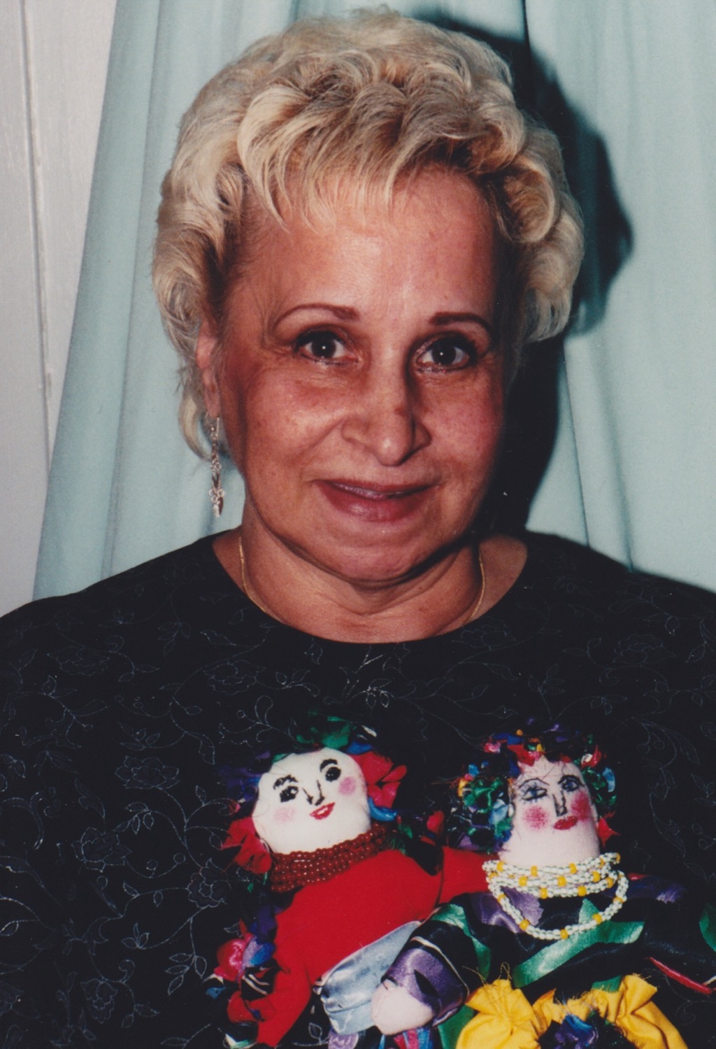
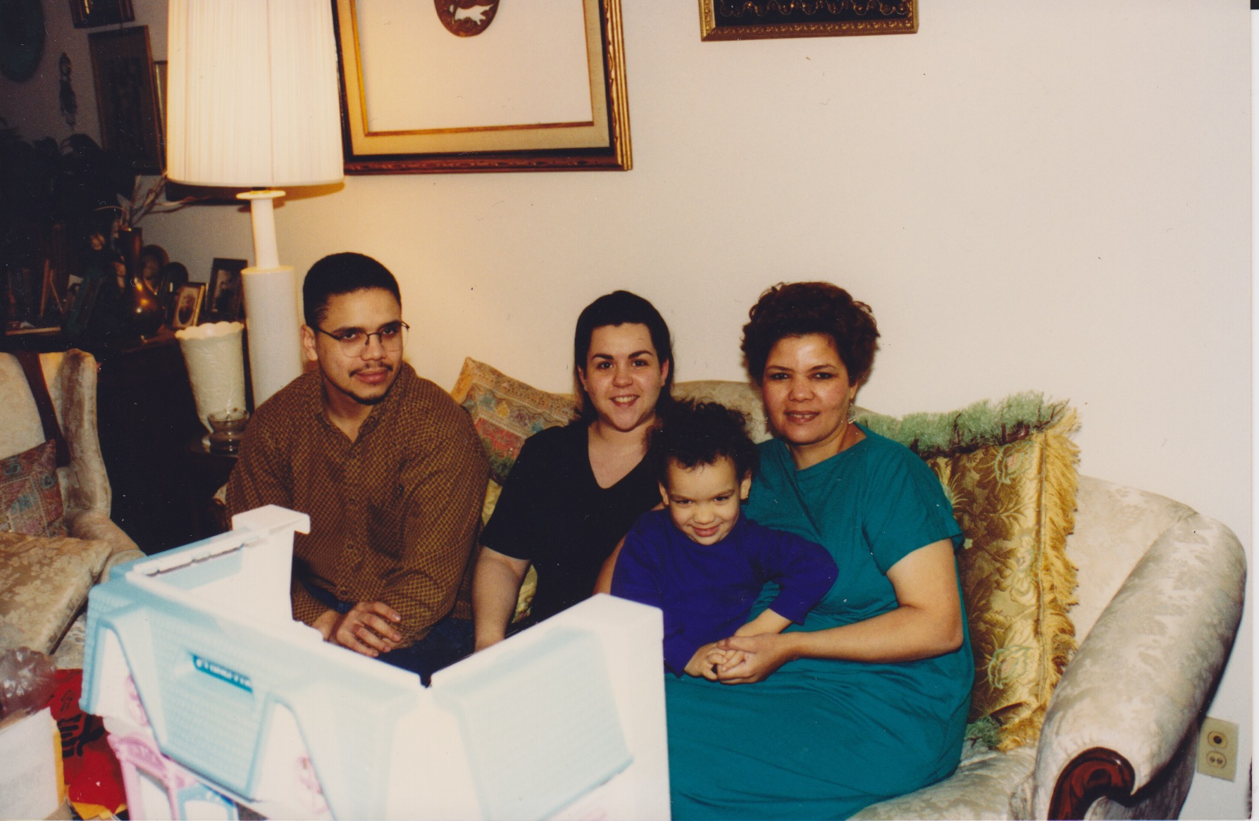
Rather than just focusing on the dolls, the site is more of a comprehensive collection of the things my grandmother made, almost like an artist's portfolio. Before moving to Queens, she lived in an apartment on the Lower East Side for around 30 years, and grammys.house is based on that space.
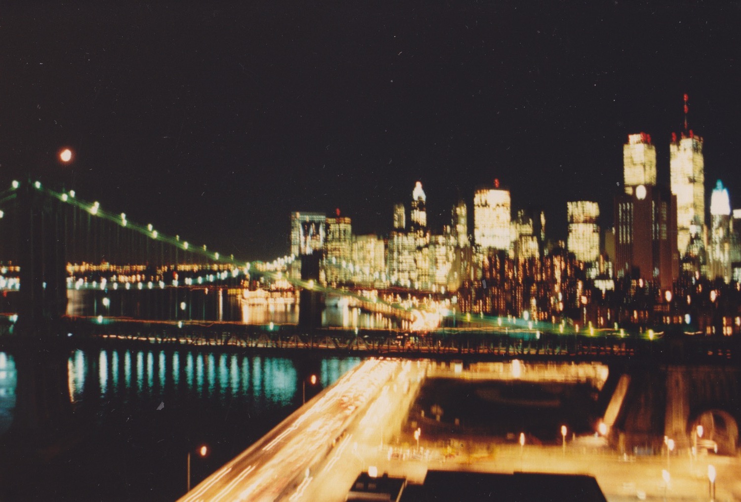
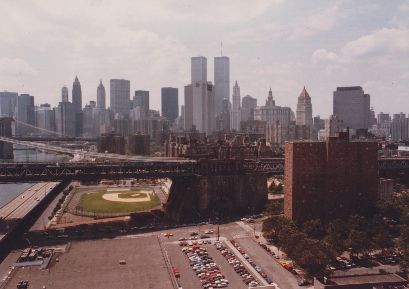
The window page is a series of nearly the same image, taken repeatedly, showing the view out of her living room window. It is the most fully realized part of this project, as the rest of the site is still in progress. The view that's shown on the site does not exist anymore partially due to 9/11 and an Extell luxury development that is now across the street. The building broke ground in 2014 well after my grandma's departure from the neighborhood. My father still lives on this block — two buildings down from her old building — so I'm often in the area. I'm a fourth generation New Yorker, this city is my hometown... that building wants us to believe we don't belong here. if they had it totally their way — they'd love for everyone to believe that we never were here.

Something that I think is lacking on the web right now is reflections on everyday experiences. That's part of the reason I found grammys.house so enjoyable. I saw you have a personal feed at jaltera.xyz. Do you think you'll make more everyday websites like these?
I agree! I'd love to make more everyday sites. I have a bad habit of trying to figure out my ideas completely, sometimes before i even start a new project. This can be limiting, so i'd like to do more fast and loose work. i love coming across sites that are from people who are simply like, I make miniatures and God is Good, isn't bioluminescence cool?, this is a collection of my dads old computer manuals, or look at these found photo booth pictures!
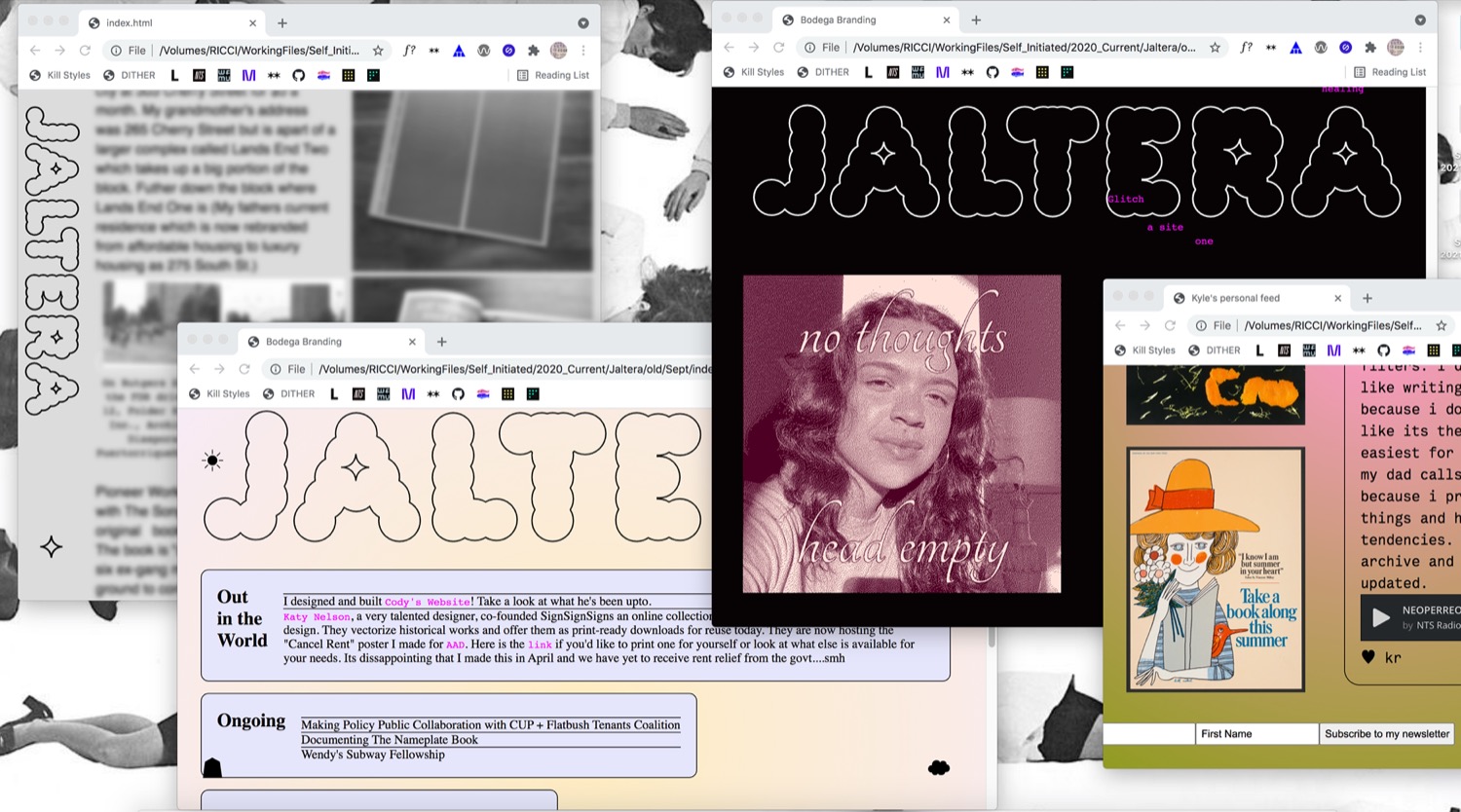
My personal feed has really made me think about what kinda stuff I share online, since i hand code the site each time to update it layout and content wise, its really funny to put in work just to display a selfie or link to youtube videos you watched that day haha. honestly thats what we do on social media anyway, share mundane shit. but the ui of those apps are really opinionated on what you should share and how it should look so it tends to yield a certain type of post that is fundamentally different from managing a personal or everyday site.
If you were able to redesign any website in the world and make it your own, what website would you choose and what would it look like?
I would love to redesign the Center for Puerto Rican Studies's site. i often look through their digital picture collection and they have a really cool archive. i feel like i could make ten different versions of this site. one of the fun versions would have a loud early web aesthetic (what I remember existing in the early 2000's, when people had more control of the visual output of the web via myspace, blingee, migente). I'm thinking super ornate, lots of gifs, music, rich with content and rich with personality. Similar feelings to something like this digital boricua publication, this relic website for the National Congress for Puerto Rican Rights, or this collection of forgotten nuyorican films.
Are there any handmade websites that you check daily?
Out of the sites I visit daily, the only one that could be considered handmade is wfmu. the site is actually on a cms system made by Ken Garson, but it seems pretty hand done. The schedule part of the site is just a big beautiful table <3. I like that the individual radio hosts have style control for their show pages! Otherwise, I browse are.na pretty much daily and probably find handmade websites on there or through gossips web a couple times a week at least.